SEEC
Designing a wellbeing app for young people who needed support, not surveillance.
Social reintegration
Building a tool that helps an organisation spot when someone is struggling before it becomes a crisis.
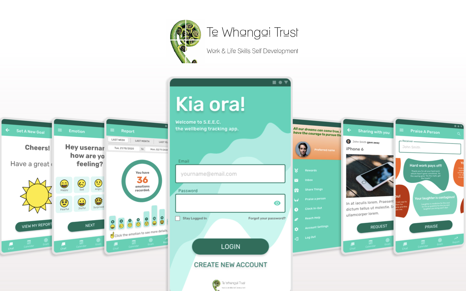
Te Whangai Trust employs young people who have faced significant life challenges, including criminal records or difficult family backgrounds. The goal was to build a native Android app that uses technology to help them stabilise their lives. By tracking daily emotions, the organisation can make informed, data-driven decisions to provide the right support at the right time.
This wasn't just a tool for one office. The plan was to prove the model within the Trust and then scale the impact across New Zealand society.
The vision:
Foundation
Starts with a simple daily mood check-in to build a habit of reflection.
Growth
The app expands into goal setting and mentorship to guide long-term personal development.
Community
A digital safety net where users share experiences, offer mentorship, and exchange resources within a trusted support network.
Validating patterns
The most important design decision in the app came down to a test.
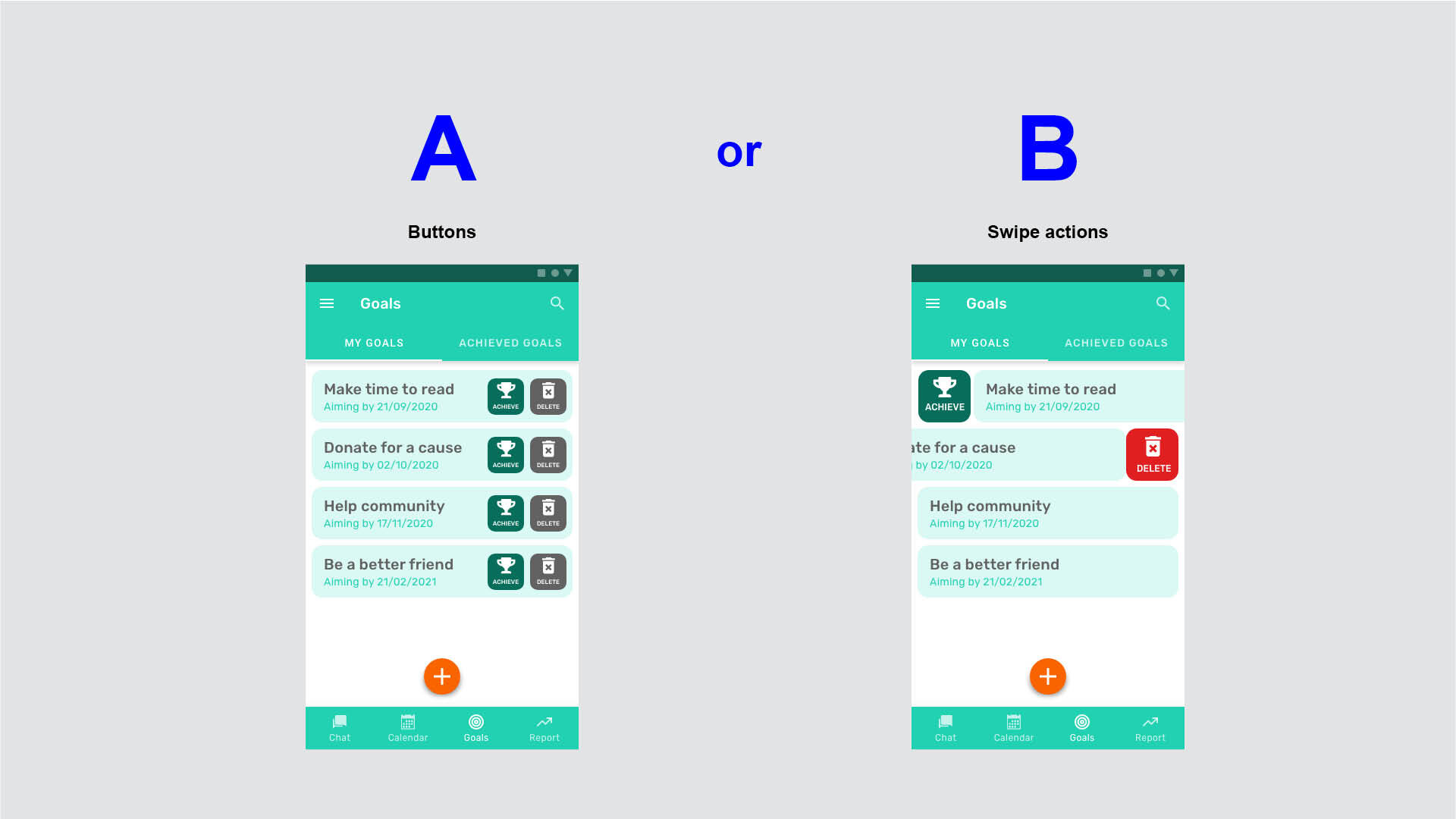
The core feature of SEEC is personal goal management — the place where young people define goals, track progress, and see themselves moving forward. Getting the interaction patterns right here mattered more than anywhere else in the app. So I ran an A/B test to find the right balance between two competing approaches:
Variant A — Buttons
A traditional button layout gave users immediately visible actions. High scannability, but the interface felt clunky and repetitive across a list of goals.
Variant B — Swipe actions
A gesture-based approach produced a cleaner, faster experience for users who got comfortable with it. The trade-off was discoverability: some users struggled to find the hidden actions without a visual cue at first.
The results were split almost evenly, which was itself a highly valuable finding. A clear majority preference would have been easy to act on; an even split meant the decision required judgment, not just data.
We moved forward with swipe actions. For young people using this app daily as part of their routine, a fast and uncluttered experience served them better in the long run than one optimised for first-time discoverability. The app was designed to be lived in, not figured out.
Android native performance
Designing for the full range of Android devices these users would actually have.
This was a native Android app, which shaped every design decision from the ground up. The young people using SEEC would be on a wide range of devices from different manufacturers, many of them older or lower spec. The interface needed to work smoothly across all of them.
I applied Material Design patterns throughout to ensure the app felt familiar and predictable from the first session. A native bottom navigation bar gave users instant access to the core pillars of the app: their goals, their emotions, their community, and their progress.
Real-time impact
From weekly check-ins to a living picture of how each young person is doing.
Before SEEC, the Trust was working from disconnected manual records and periodic reviews. By the time a support worker identified that someone was struggling, valuable time had already passed. The shift to a digital platform changed that relationship fundamentally.
Managers can now see emotional trends as they develop, allowing them to reach out at the right moment rather than waiting for a scheduled session. For the young people using the app, having a visible record of their own moods and achievements builds something that is hard to manufacture through any other means: a sense of their own progress.
And by embedding mentorship and peer support directly into the platform, the Trust has built a culture where giving back is part of the daily routine, not a separate programme.
SEEC was designed to feel like it belonged to the people using it. That sense of ownership is what makes the support work.