Spark IoT Bridge
From audit to action: redesigning a platform that operators depend on.
Audit & discovery
Before touching a single pixel, I needed to understand the full scale of the problem.
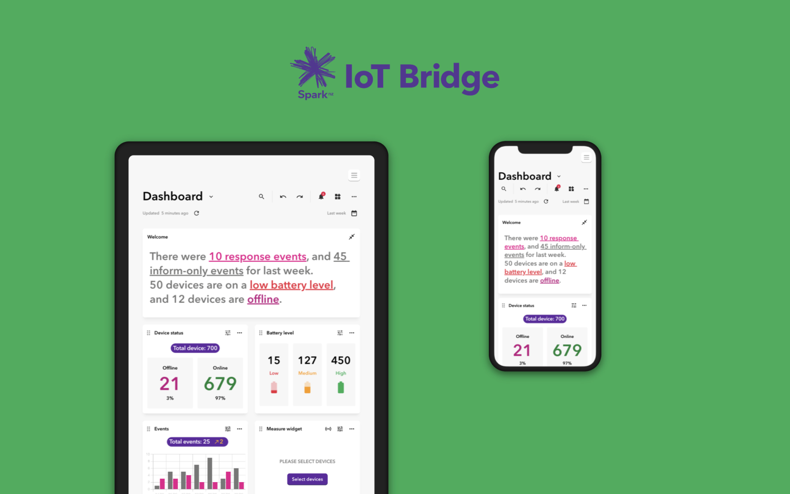
Spark IoT Bridge manages connected device ecosystems for some of New Zealand's largest organisations. When I joined the project, the platform had accumulated years of inconsistent design decisions. Rather than jumping straight into the art, I ran a comprehensive UX review of the entire product and produced a formal audit report documenting every area where the interface was causing friction.
The audit gave the team something they hadn't had before: a shared, evidence-based picture of the problem.
No more opinions about what felt off, but a structured assessment of where the platform was failing its users and why. That document became the foundation for every design decision that followed.
Unified framework
The audit pointed to one root cause: there was no shared design foundation.
Fixing screens one by one wouldn't work; we needed a systemic resolution. I led the design of a component library for Spark IoT Bridge, establishing a consistent design language built specifically to handle the density and complexity the product required.
With reusable components covering everything from buttons and inputs to cards and displays, designers and engineers were working from the same building blocks for the first time. New features could be built faster and more consistently, and the visual debt that had built up over years was systematically resolved.
Data clarity
With a solid foundation in place, the real design challenge could begin: making complex data readable under pressure.
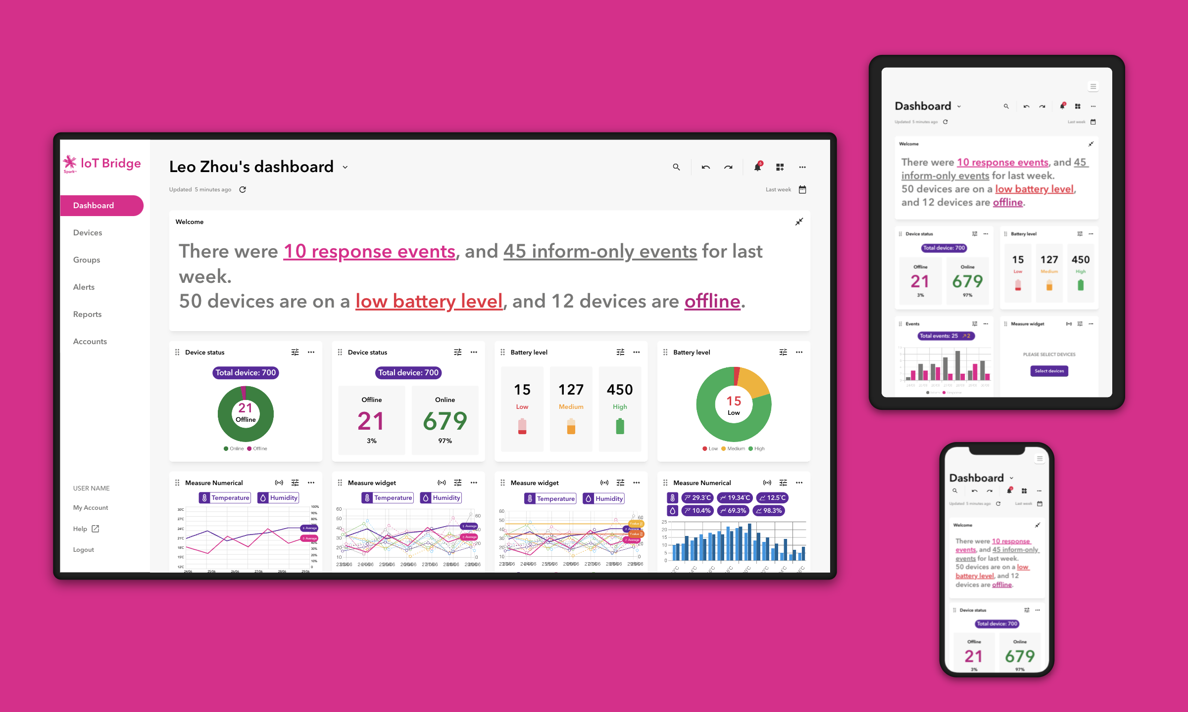
The IoT Bridge dashboard needed to serve operators monitoring hundreds of devices at once across very different contexts and responsibilities. A single fixed layout couldn't work for all of them. So I built a modular widget system that lets each operator configure their view around what matters most to their specific role.
Three capabilities shaped the final experience:
Custom views
Operators select and arrange the data cards relevant to their responsibilities. The dashboard reflects how they work, not how the system was built.
Night and day modes
Made monitoring more comfortable across extended shifts and low-light environments — a standard feature with a direct impact on how reliably operators can use the system.
Smart hierarchy
Progressive disclosure kept the full depth of analytics accessible without overwhelming the primary view. Operators stay oriented at a glance and go deeper only when they need to.
Impact & growth
A platform rebuilt from the foundation up, ready for what comes next.
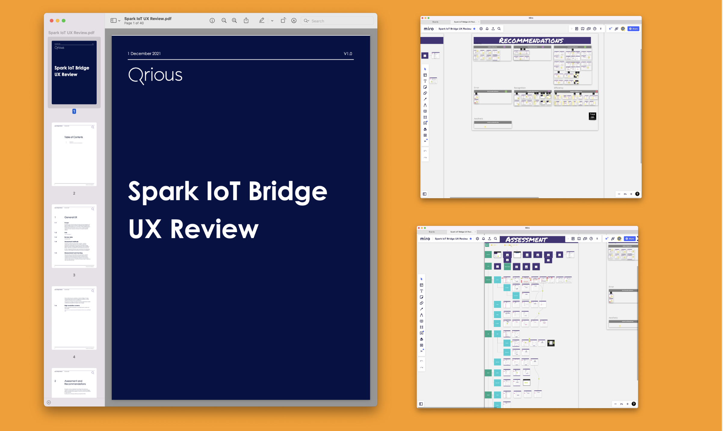
The shift from reactive patching to systematic design changed how the product felt and how the team worked. Features that previously required significant rework could now be built on proven, shared components. The interface became faster to navigate and easier to trust.
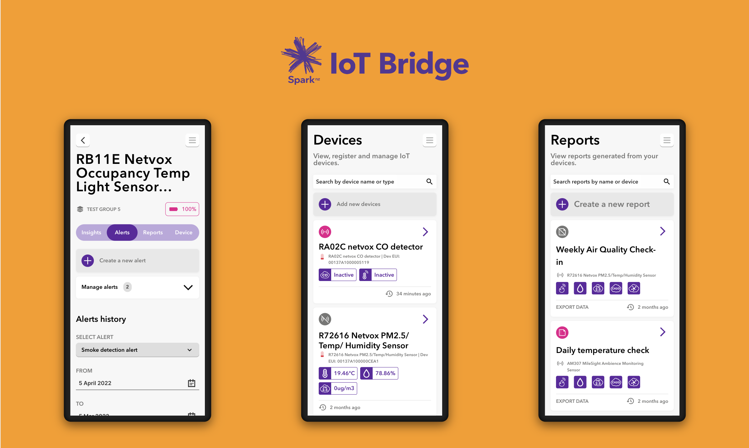
The final product tells the complete story of what operators needed: a clear view of active alerts, a versatile way to find and manage devices, and a reporting layer that captures everything for the rest of the business.